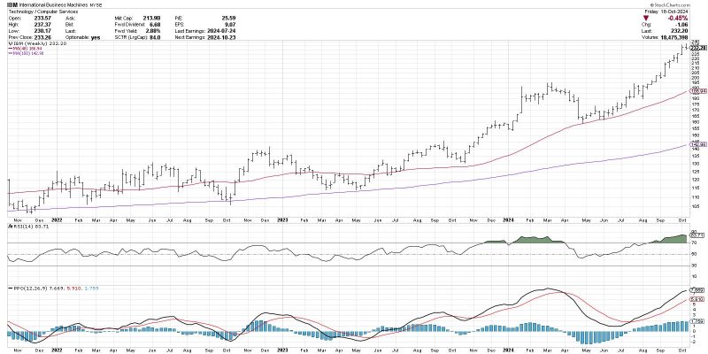
The MACD Histogram: Unveiling the Mysteries of Trend Changes
The Moving Average Convergence Divergence (MACD) histogram is a powerful technical indicator that provides valuable insight into market trends and potential changes in direction. Traders and analysts around the world rely on the MACD histogram to help them anticipate shifts in market sentiment and make more informed trading decisions. In this article, we will delve into the intricacies of the MACD histogram and explore how it holds the key to anticipating trend changes.
Understanding the MACD Histogram
The MACD histogram is derived from the MACD line, which is calculated by taking the difference between two exponential moving averages (EMAs) of an asset’s price. The MACD line is then used to generate the MACD histogram, which represents the difference between the MACD line and the signal line (another EMA of the MACD line).
Interpreting the MACD Histogram
The MACD histogram consists of bars that oscillate above and below a zero line. When the histogram bars are above the zero line, it indicates that the MACD line is above the signal line, suggesting bullish momentum in the market. Conversely, when the bars are below the zero line, it signals that the MACD line is below the signal line, indicating bearish momentum.
Anticipating Trend Changes with the MACD Histogram
One of the key aspects of the MACD histogram is its ability to provide early signals of potential trend changes. Traders often look for divergences between the MACD histogram and the price of an asset to identify possible reversals in the market.
Bullish Divergence: A bullish divergence occurs when the price of an asset makes a lower low, but the MACD histogram forms a higher low. This can indicate weakening bearish momentum and a potential trend reversal to the upside.
Bearish Divergence: Conversely, a bearish divergence occurs when the price of an asset makes a higher high, but the MACD histogram forms a lower high. This can signal weakening bullish momentum and a potential trend reversal to the downside.
Additionally, traders pay close attention to the slope of the MACD histogram bars. When the bars are steeply rising or falling, it may indicate a strong trend in the market. However, if the bars start to flatten out or move in the opposite direction, it could suggest that the trend is losing momentum and a reversal may be on the horizon.
Incorporating the MACD Histogram into Your Trading Strategy
To effectively utilize the MACD histogram in your trading strategy, it is important to combine it with other technical indicators and analysis techniques to confirm signals and reduce the risk of false positives. By incorporating the MACD histogram into your trading arsenal, you can gain a deeper understanding of market trends and enhance your ability to anticipate trend changes effectively.
In conclusion, the MACD histogram is a powerful tool that holds the secret to anticipating trend changes in the market. By mastering the nuances of the MACD histogram and incorporating it into your trading strategy, you can gain a competitive edge and improve your ability to make informed trading decisions. Keep an eye on divergences, monitor the slope of the histogram bars, and use the MACD histogram in conjunction with other technical indicators to unlock its full potential and navigate the dynamic world of financial markets with confidence.
